

Sassの組み込み関数を使えるようになると楽だぞ、
え、いや、誰?
いろんな数を代入できる変数xです・・・彼は組み込み関数を教えてくれるようです・・・
それは嬉しいけど、新キャラとか出るんだ…、なんか僕より主人公っぽいし、複雑な気持ち・・・。
組み込み関数とは
というわけで、CSSをいじっているときでも、「この数よりもうちょっと大きい数値にしたいな」とか、「この色よりもうちょっと明るくしたいな」とか、ある数値を基準にして変更したい数値って結構いっぱいありますよね。
SCSSやSASSには「〇〇と入れたらそれに+◆(ある計算)をして▲▼と返す」という関数を自作して使うことができます。でも関数を自分で作るのって難しそう…。
そういうときは組み込み関数という、もうすでに用意されている関数が存在しますので、その機能を使うとすごく便利になるのです。
組み込み関数の使い方
例えば、色を明るくしたいとき、red と指定した色より明るい色をわざわざ探したり、数値計算するのはめんどいことです。
background: 〇〇〇; ←これよりちょっと明るい色にしたい
そういうとき、
background: lighten(〇〇〇, 20%);
と入力するだけで、元の 〇〇〇 より20%明るい色を指定できます。
この lighten という関数だけではなく、ほかにも様々な機能のある関数が、すでにいっぱい用意してあるわけですね。覚えて使えるようになるとすごく便利そうです。
組み込み関数の例
lighten / darken 色の輝度を変える
lighten (●●, 〇〇%)・・・ ●●(色)を〇〇%明るくする
darken (●●, 〇〇%)・・・ ●●(色)を〇〇%暗くする
SCSSで指定
.circlebox div:nth-of-type(1) {
    background: darken(red, 20%);
}

.circlebox div:nth-of-type(2) {
    background: red;
}

.circlebox div:nth-of-type(3) {
    background: lighten(red, 20%);
}
CSSで表示される色
.circlebox div:nth-of-type(1) {
  background: #990000;
}

.circlebox div:nth-of-type(2) {
  background: red;
}

.circlebox div:nth-of-type(3) {
  background: #ff6666;
}
saturate / desaturate 色の彩度を変える
saturate (●●, 〇〇%)・・・ ●●(色)を〇〇%鮮やかにする
desaturate (●●, 〇〇%)・・・ ●●(色)を〇〇%濁らせる
transparentize / rgba 色の透明度を変える
transparentize (●●, .〇)・・・ ●●(色)を〇割透明にする。
SCSSで指定
.circlebox div:nth-of-type(1) {
    background: transparentize(red, .6);
    margin: 8px;
}

.circlebox div:nth-of-type(2) {
    background: transparentize(red, .2);
}

.circlebox div:nth-of-type(3) {
    background: red;
}
CSSで表示される色
.circlebox div:nth-of-type(1) {
  background: rgba(255, 0, 0, 0.4);
  margin: 8px;
}

.circlebox div:nth-of-type(2) {
  background: rgba(255, 0, 0, 0.8);
}

.circlebox div:nth-of-type(3) {
  background: red;
}
rgba (●●, .〇)・・・ ●●(色)を〇割 不透明にする。
上の transparentize と違って数値が大きいほど不透明になります。
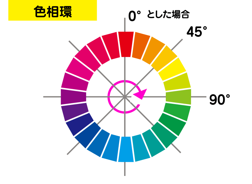
adjust-hue 色の色相を変える
adjust-hue (●●, 〇〇deg)・・・ ●●(色)を〇〇度 色相を変える。
SCSSで指定
.circlebox div:nth-of-type(1) {
    background: red;
}

.circlebox div:nth-of-type(2) {
    background: adjust-hue(red, 30deg);
}

.circlebox div:nth-of-type(3) {
    background: adjust-hue(red, 60deg);
}
CSSで表示される色
.circlebox div:nth-of-type(1) {
  background: red;
}

.circlebox div:nth-of-type(2) {
  background: #ff8000;
}

.circlebox div:nth-of-type(3) {
  background: yellow;
}
invert 色を反転する
invert (●●)・・・ ●●(色)を反転する。
complement 補色に変更する(彩度や明度は変わりません)
complement (●●)・・・ ●●(色)の補色に変える。
組み込み関数の利用
利用方法はいろいろあるかと思いますが、例えばグラデーションで、少しずつ明るくなっていくグラデーション、少しずつ色相が変わっていくグラデーション、などを作るときに利用できます。
このグラデーションは
赤 → 赤の色相環を30度変えた色 → 赤の補色
という変遷のあるグラデーションです。
SCSSで指定
.circlebox7 {
    width: 200px;
    height: 200px;
    background: linear-gradient(red, adjust-hue(red, 30deg),complement(red));
    margin: 8px;
}
CSSで表示される色
.circlebox7 {
  width: 200px;
  height: 200px;
  background: linear-gradient(red, #ff8000, cyan);
  margin: 8px;
}
組み込み関数にはほかにも数値、文字列、配列などを扱えるものがあります。


コメント